Logo design and visual branding for an Oklahoma brewery concept that is still in the aspirational stage.
Bellamy Brewing isn't just a brewery—it's a vision. An ambition. The dream of a burgeoning Oklahoma brewer. Bringing this dream into reality takes more than just the brewing process. It requires a compelling brand identity. Inspired by the rich history of Samuel Bellamy, the wealthiest pirate known, Bellamy Brewing draws on his story to infuse its visual identity with inspiration, purpose, and character.
Challenge
Crafting a visual brand for a brewery that is still in the aspirational stage. How might we translate the essence of Samuel Bellamy's story into a brand identity that not only resonated with the client but also captivated potential consumers in a competitive market?
Outcome
Through a meticulous strategic design process, we developed a brand identity that seamlessly integrates classic pirate imagery with a contemporary twist. The result is more than just a logo, it's a visual system that represents the pursuit of dreams. Bellamy Brewing now possesses an iconic and memorable identity, setting the stage for its future as a real, kick-ass brewery.
Scope of Project
Discovery workshops
Identity system
Establishing a design direction without a full blown brand strategy.
Calibrating the client’s design tastes and desires.
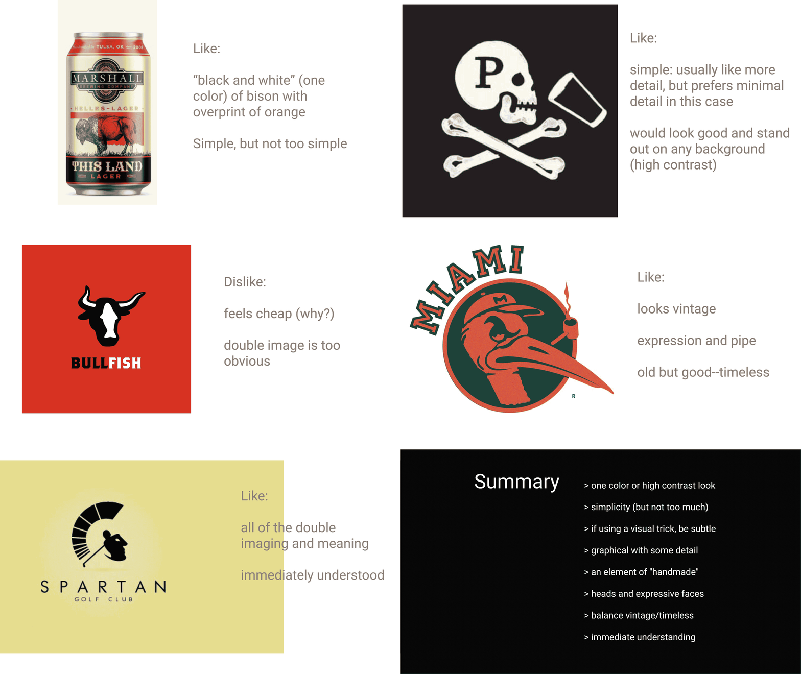
To bridge the gap between the client's vision and the design process, we went through a couple discovery workshops. These sessions involved analyzing preferred and disliked design examples, extracting valuable insights to define positive and negative constraints.
We established a check list of design preferences:
One-color or high-contrast aesthetics
Striking a balance between simplicity and complexity
Subtle use of visual tricks
Graphic elements with a touch of intricate details
A suggestion of a handmade touch
Incorporating expressive faces
Striking a balance between vintage and timeless
Immediate visual comprehension
Using visuals to get past the subjectivity of words.
To solidify the visual direction, we created mood boards for typography and graphic style. These boards provided real references, enhancing our shared understanding of the chosen aesthetic.
A fun system of visual branding based around a clever logo.
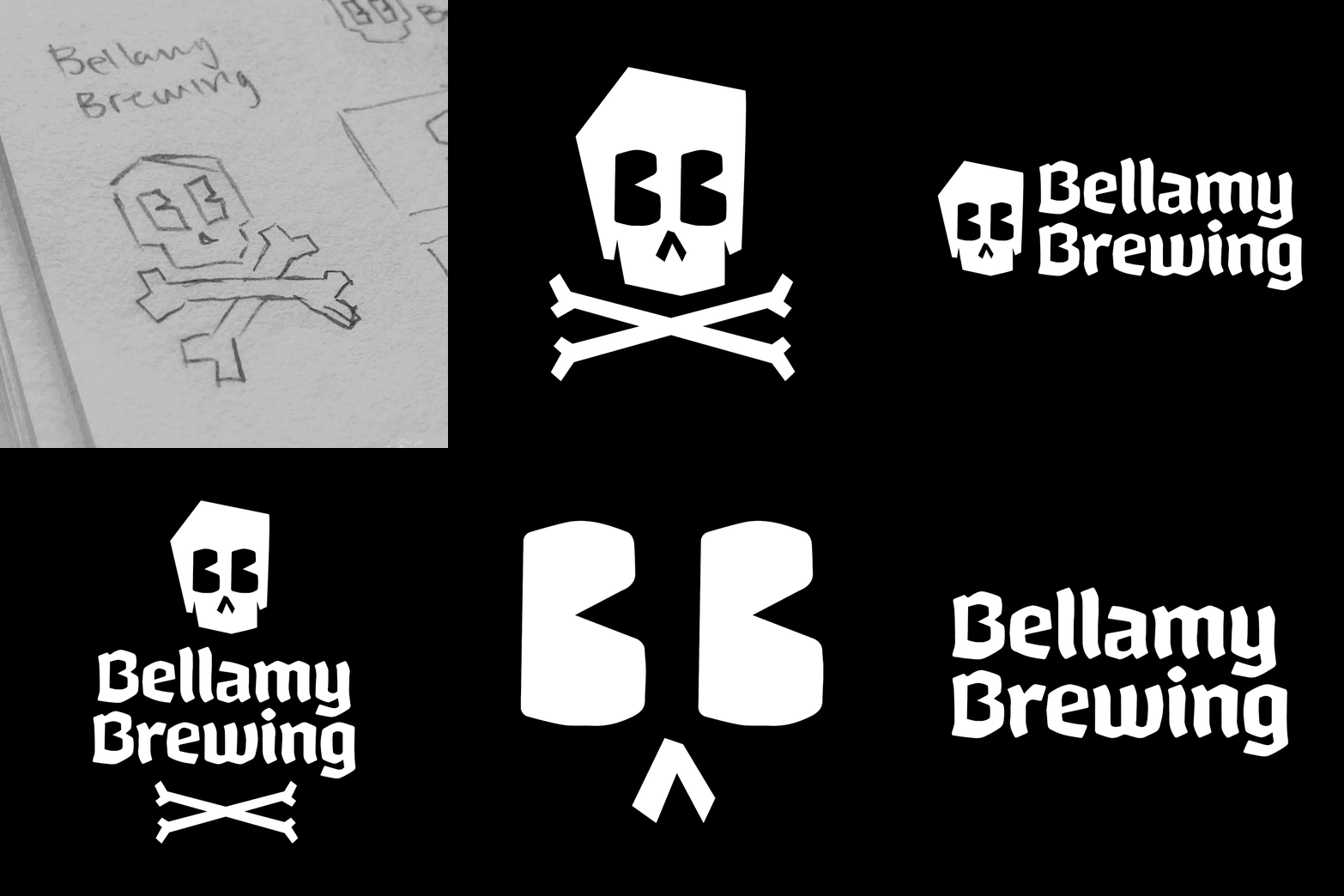
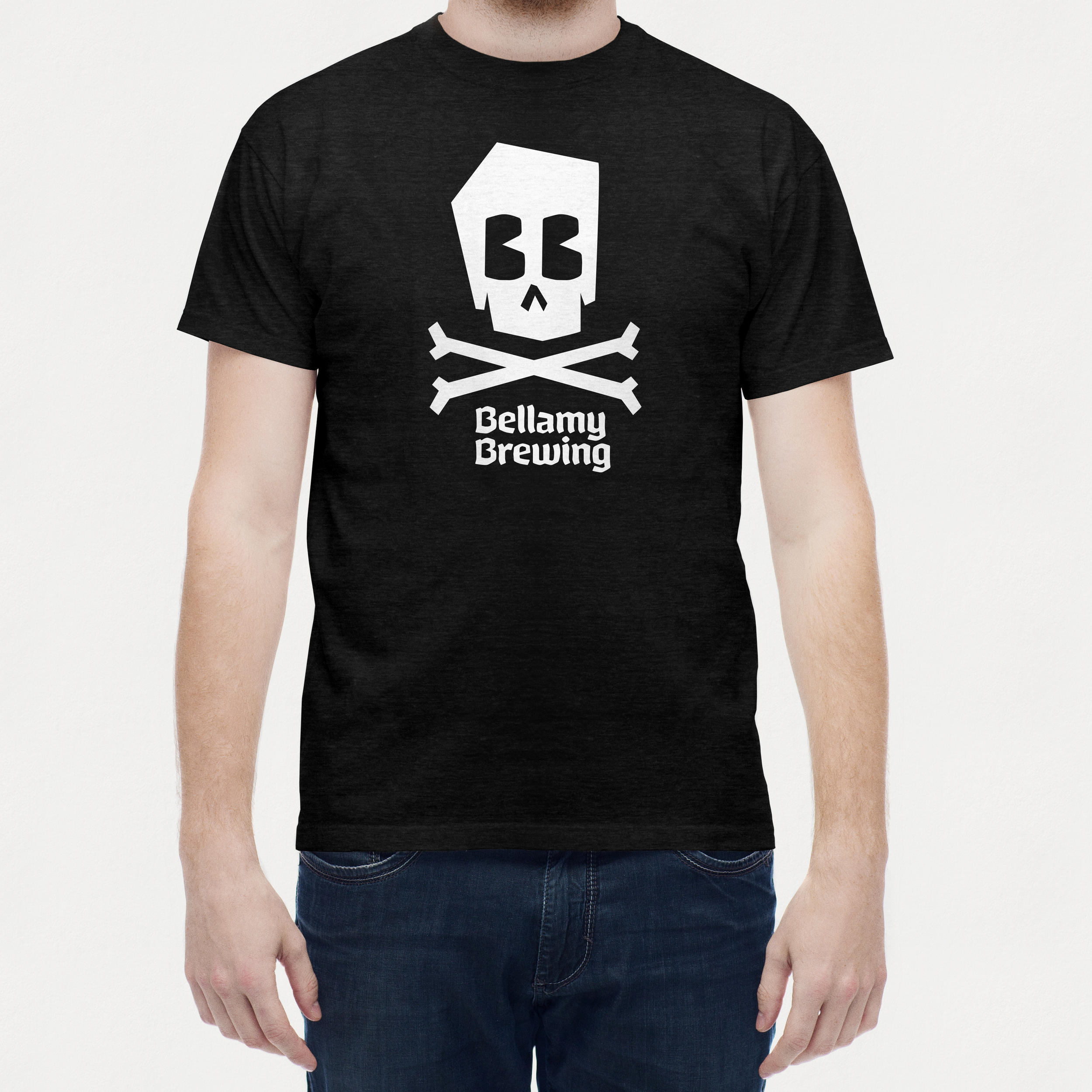
Bellamy Brewing's new branding draws from classic pirate symbolism, featuring a large black flag with a “Death's Head and Bones.” The custom typography strikes a balance between bold, legible, and unique, avoiding excessiveness of hand lettering. Supporting graphics echo the typography's angles and playfulness, adding a nuanced layer of detail to icons and illustrations.
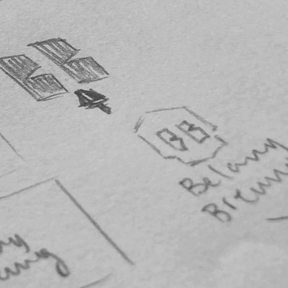
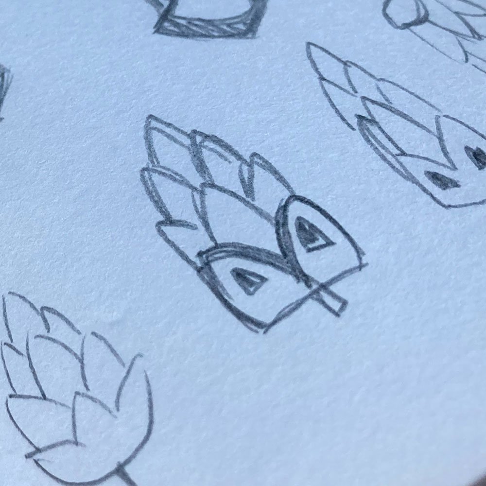
The core icon of the brand cleverly incorporates a visual trick—the eyes of the skull double as the letter B's, pulled straight from the main wordmark. This subtle easter egg pays homage to classic cartoon eyes, infusing the brand with character and uniqueness.
With the unveiling of Bellamy Brewing's new visual identity, the dream brewery takes a significant step closer to its realization. Armed with a distinctive and captivating visual brand, Bellamy now stands poised to make a lasting impact in the competitive brewing landscape.


