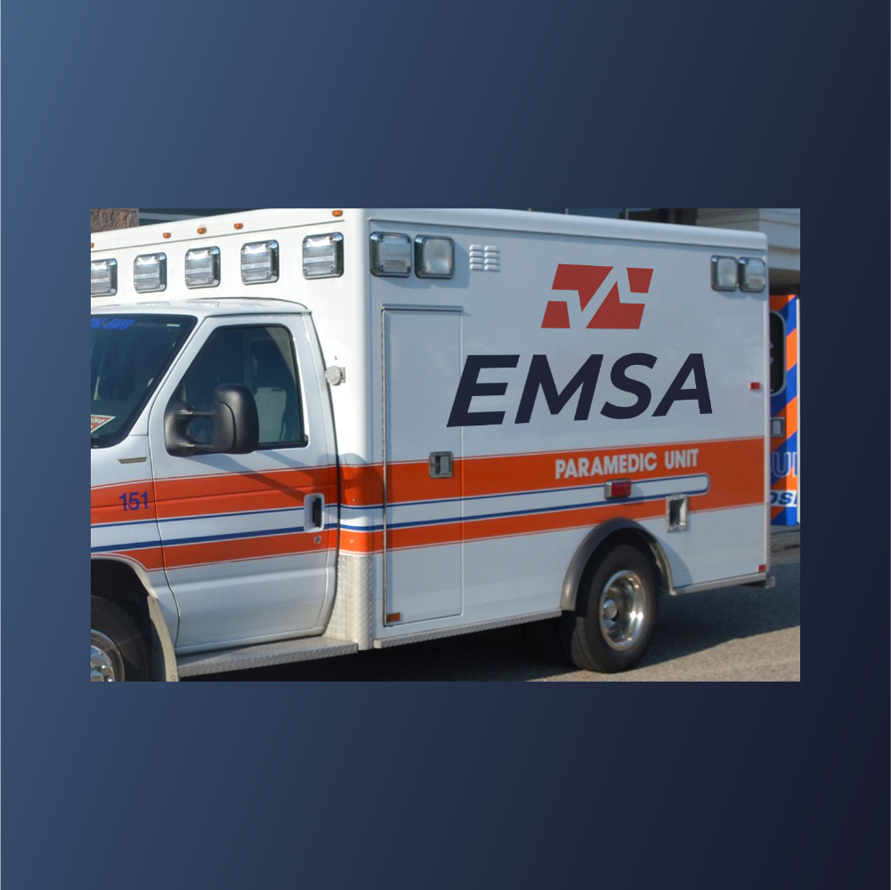
An ambulance ride to the logo hospital.
EMSA (Emergency Medical Services Authority) was in need of its own ambulance ride to the nearest logo hospital.Here, I decided to liven the type a bit with Montserrat, instead of having it utilitarian like the Helvetics original. Then I deconstructed the A and used its geometry to make a simplified heart monitor pulse.A cheat code to decent design is to steal geometry from the typeface being used. Branding can be like solving a puzzle. And the pieces to the puzzle can usually be found in the type.Agree or disagree? Hit me up and let’s talk about it.


