Mini case study: Seeke logo and identity system.
“Russell is very forward-thinking. He asked questions and gave his honest input that a direction we had in mind might not work down the road. He was direct in what he thought would be best for us.”
I love being able to see long-time BMX homies in the second passion/phase of their life. Despite all the "life experience" I missed from riding so much, BMX seems to be a super magnet that attracts super creative and passionate people into my life. I'm forever grateful for BMX, bikes in general, and the people they introduce to me. I'm stoked to start showing this identity I did for my friends over at Seeke Creative.
I made the identity into a system of assets:
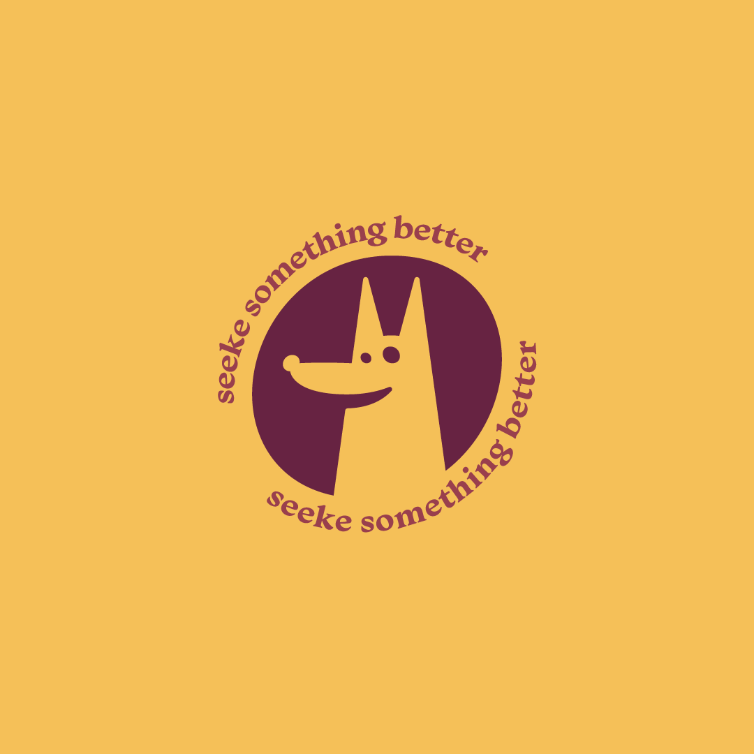
Flexible logo options
brand artifacts
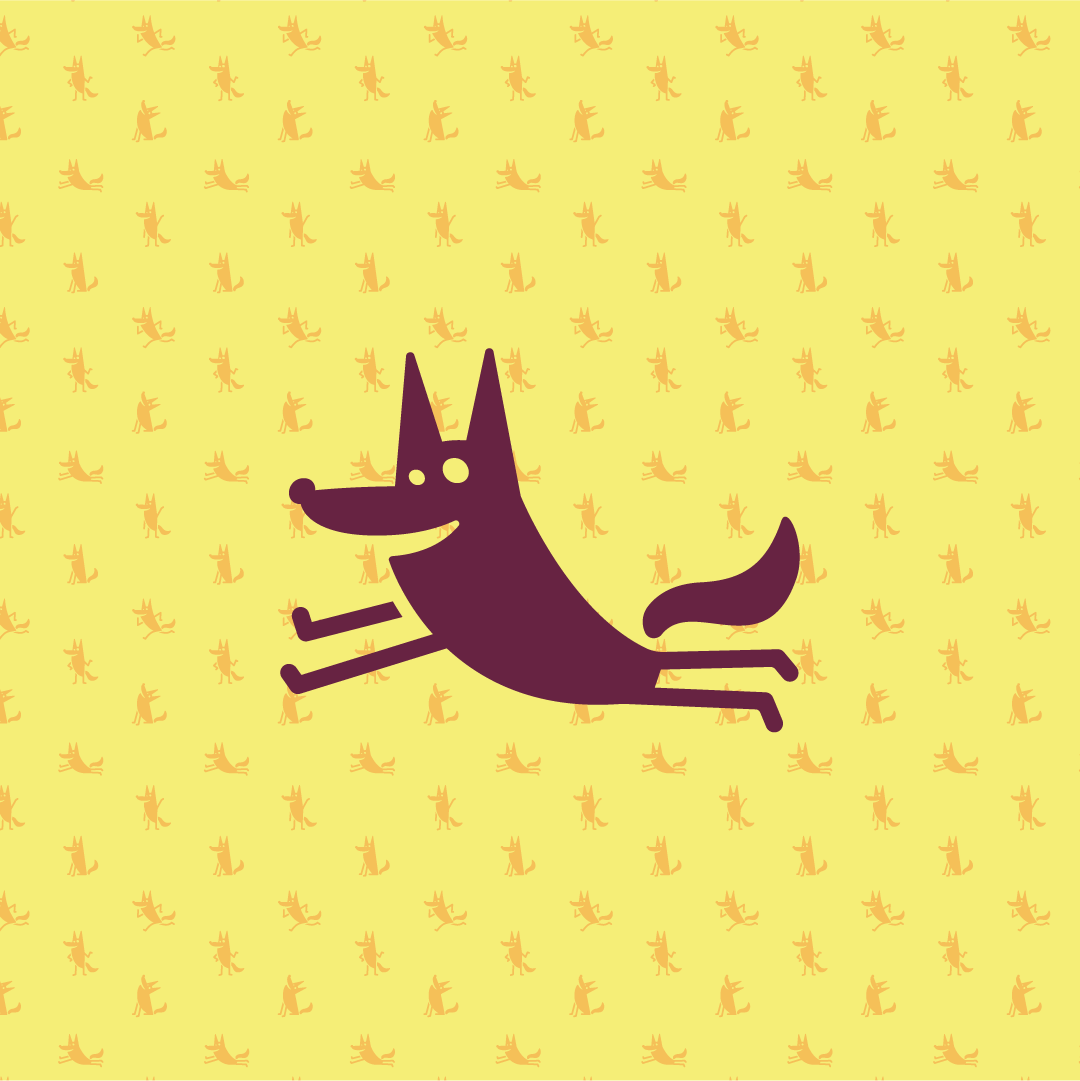
patterns
custom illustrated icons
animated gifs/Instagram Story stickers

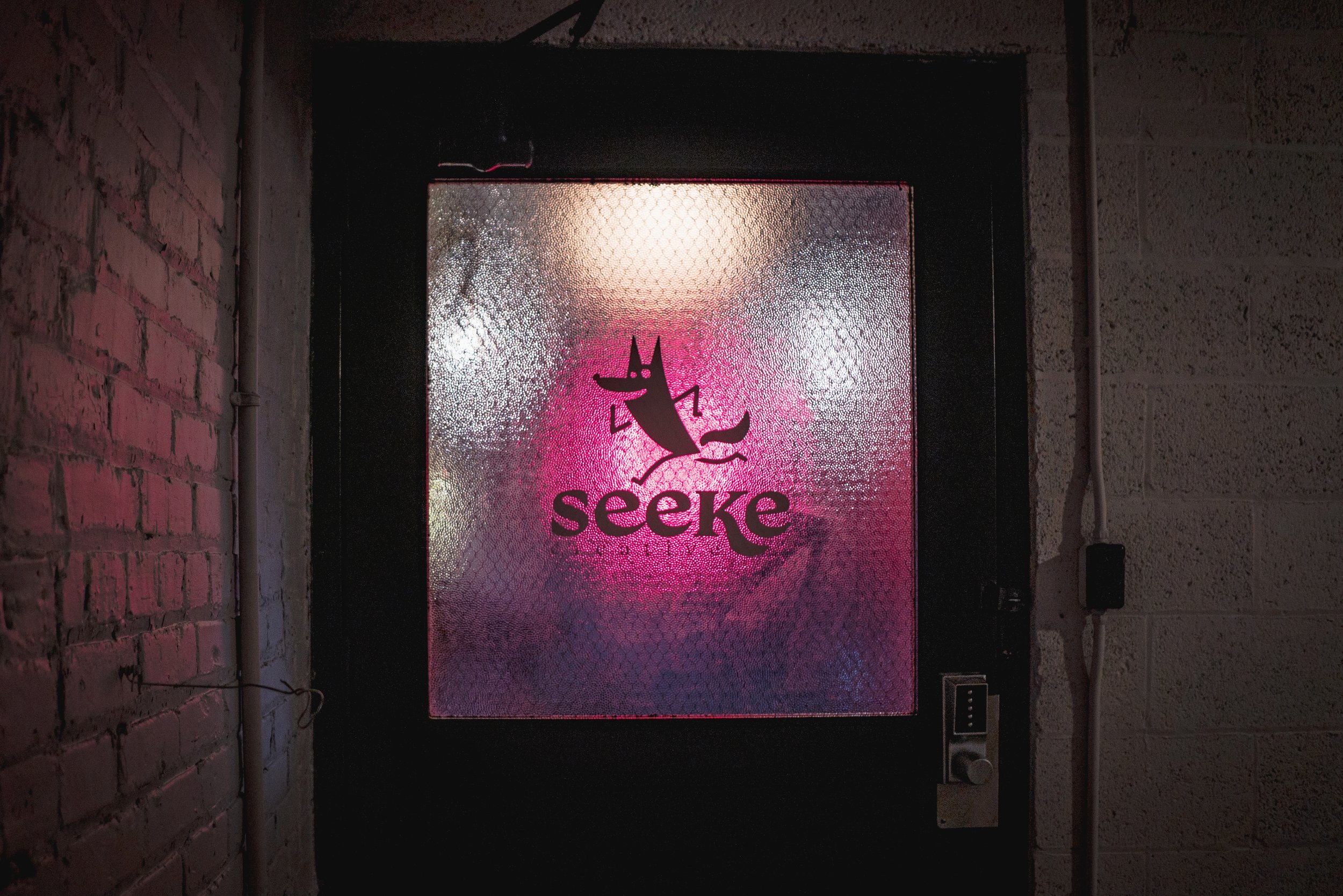
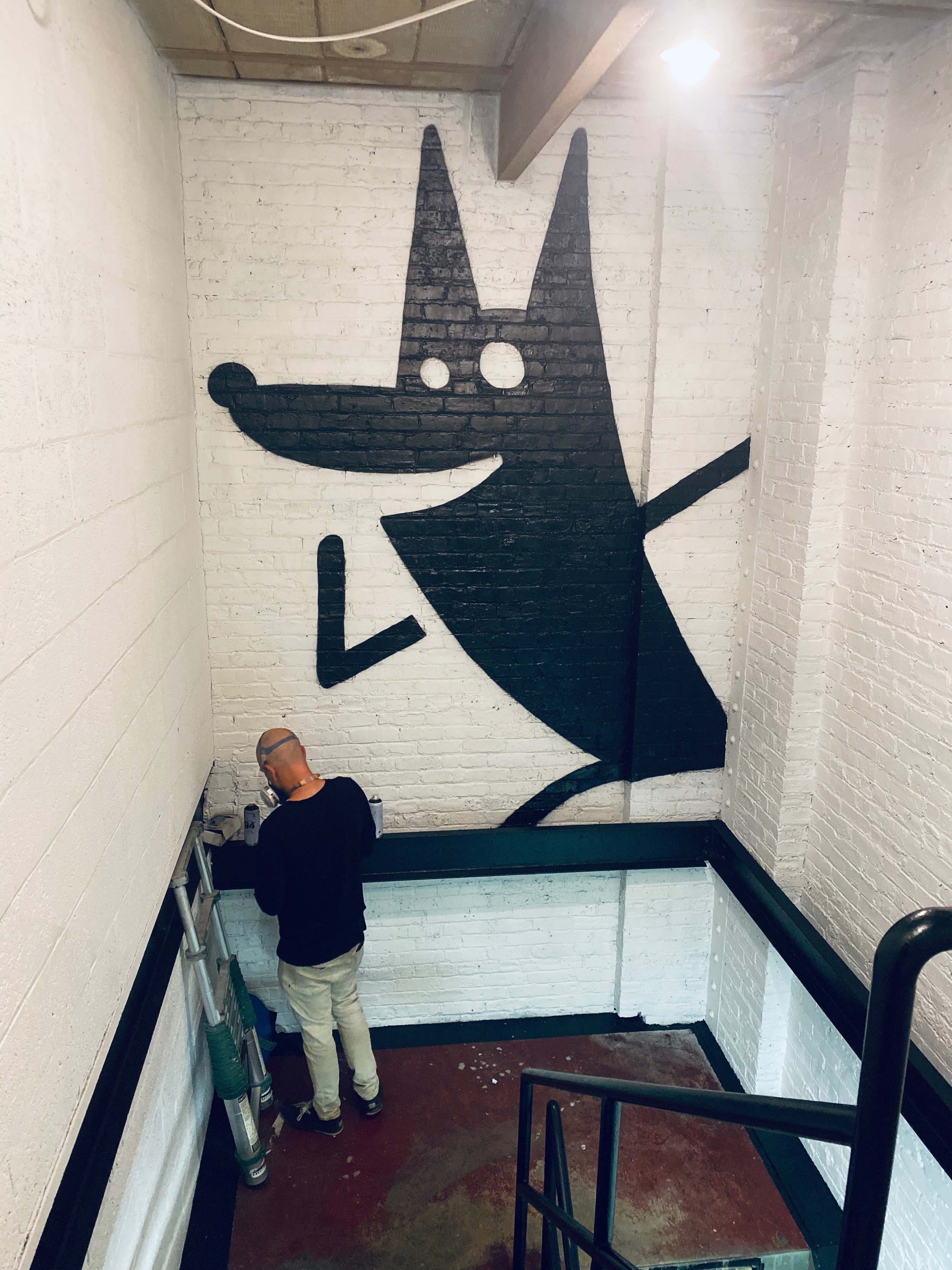
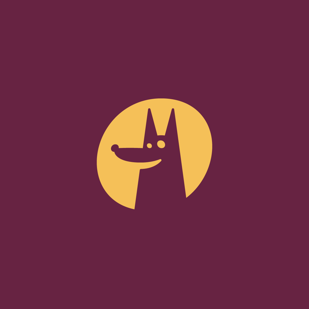
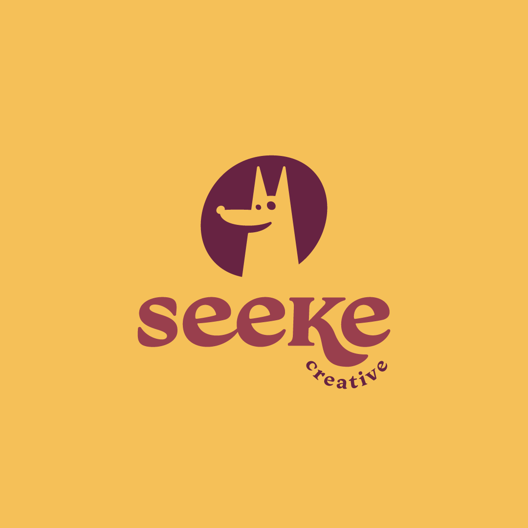
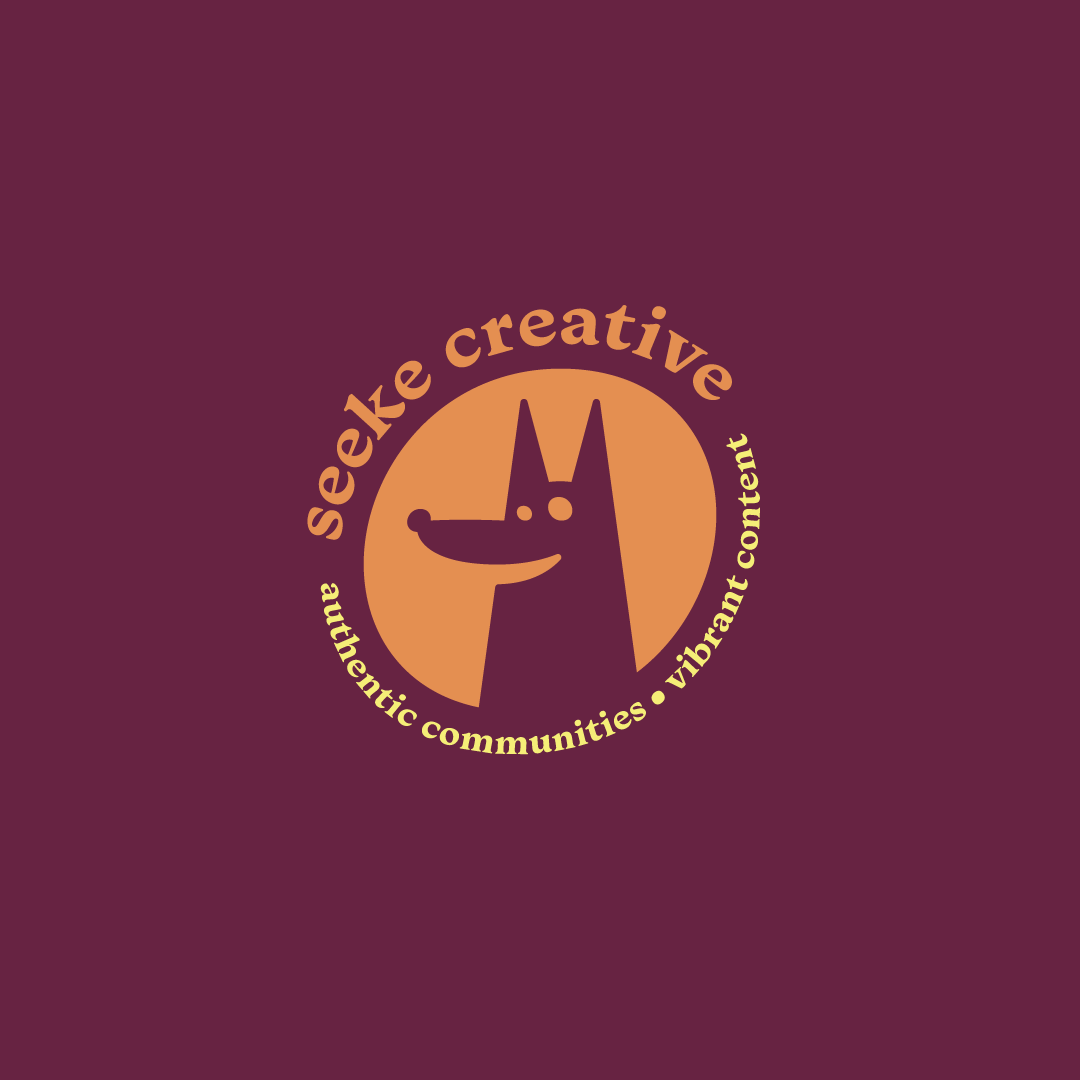
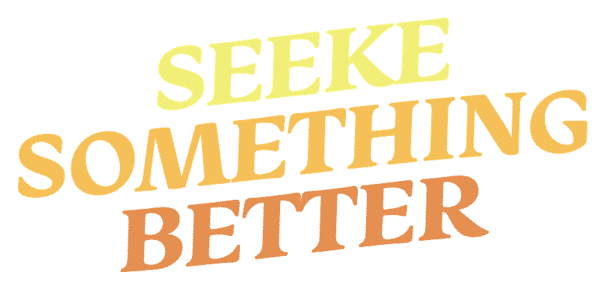
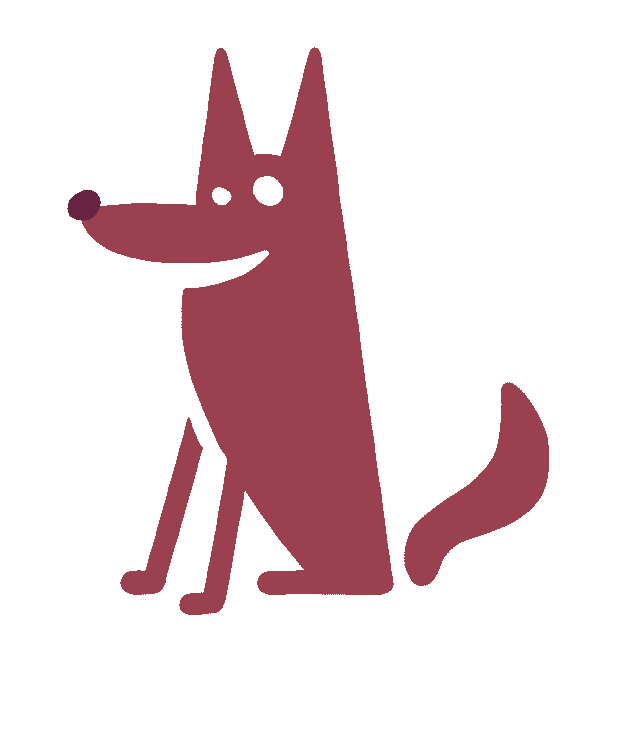
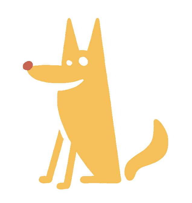
We came up with this fun, minimal wolf dude and paired him with a custom wordmark. The type is Monarcha. I used a ligature for the first EE in “Seeke.” Ligature is just a fancy way to say that the two E’s have a custom connection.
The leg of the K is completely custom as well. And, SURPRISE, it becomes the tail of our wolf-dude.“My partner and I know we created the best branding possible because Russell helped us come to an agreement on the vision and style of our brand.”

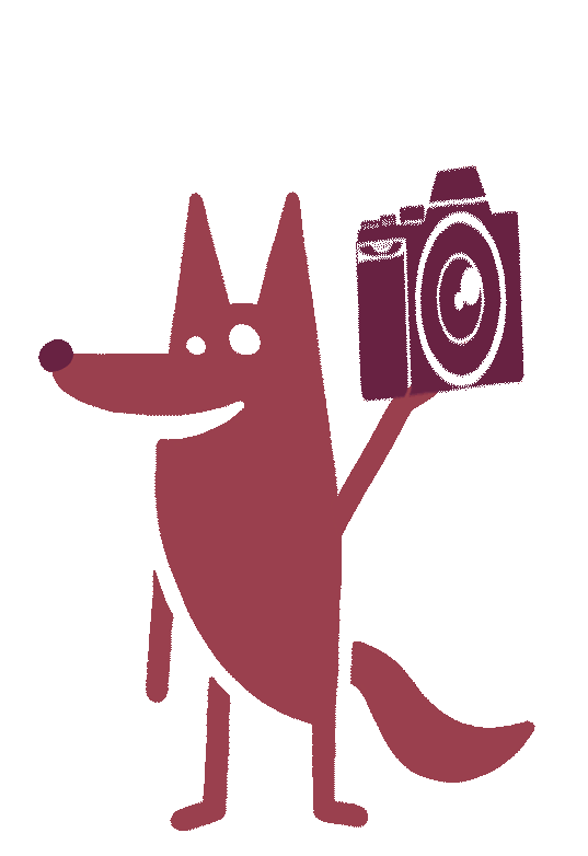
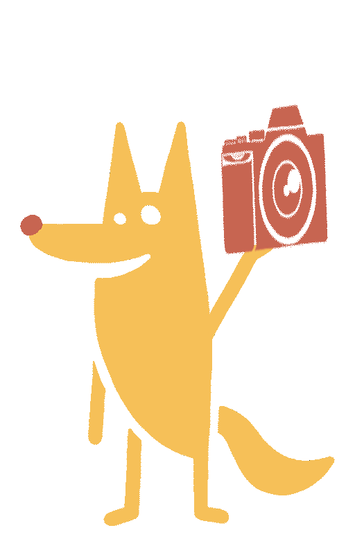
We also created 6 custom icons/illustrations for their main "mascot." I kept the wolf super simple to make him easily recreated by anyone. The guys at Seeke should be able to use these icons any way they please: as stand-alone graphics for merch, as artifacts to stylize their content, and perfect for animating.
And bonus: when you put them all together, they make an awesome and fun pattern.
“Russell is professional but not rigid, excited about his ideas but not closed off to new ones. He gave us all the pieces we needed to brand our business.”
If you need content creation hit-up the dudes @seekecreative. I think they've already gone viral on the ol TikTok.